Byrne and Brâncuși
Sitting with the artist Oisín Byrne over a toasted cheese sandwich for lunch in the Autumn we discussed how we could show his new triptych of screen prints at Conolly; what would make sense given the size and colour and impact of his works. I shyly mentioned about a rare, beautiful Brâncuși photograph I had seen of flowers in a vase, now at the Pompidou, and how beautiful it would look with his work. Oisín said he had the same instinct about this crazy idea of pairing - impossible to realise but exactly what would make sense! We laughed as we recalled that Wayne Kostenbaum had mentioned Brâncuși in his opening words in the catalogue for Oisín’s show ‘Cut Flowers” at Connolly 2021.
Secretly I asked my contacts in the art world and checked sales catalogues but there were no Brâncuși photographs to borrow or for sale. I didn’t want to give up on this as now the idea had become a fixation – in my mind, the only piece that would work with Oisín’s triptych. And then I found the Grob Gallery in Geneva who represented Brâncuși and owned the very photograph, ‘Bouquet’ that I had seen in New York all those years ago. With a deep breath, I wrote explaining about Connolly and Oisín and how this photograph was so significant, expecting to receive a polite rebuttal. Imagine my elation when I immediately received the most positive response from David Grob… and that he loved Connolly and yes, we could show the work!
I don’t always believe in fate but this was definitely a case of putting something out into the universe and it being answered. American writer and poet, Wayne Koestenbaum has agreed to write the opening of the catalogue for the show …
- Isabel

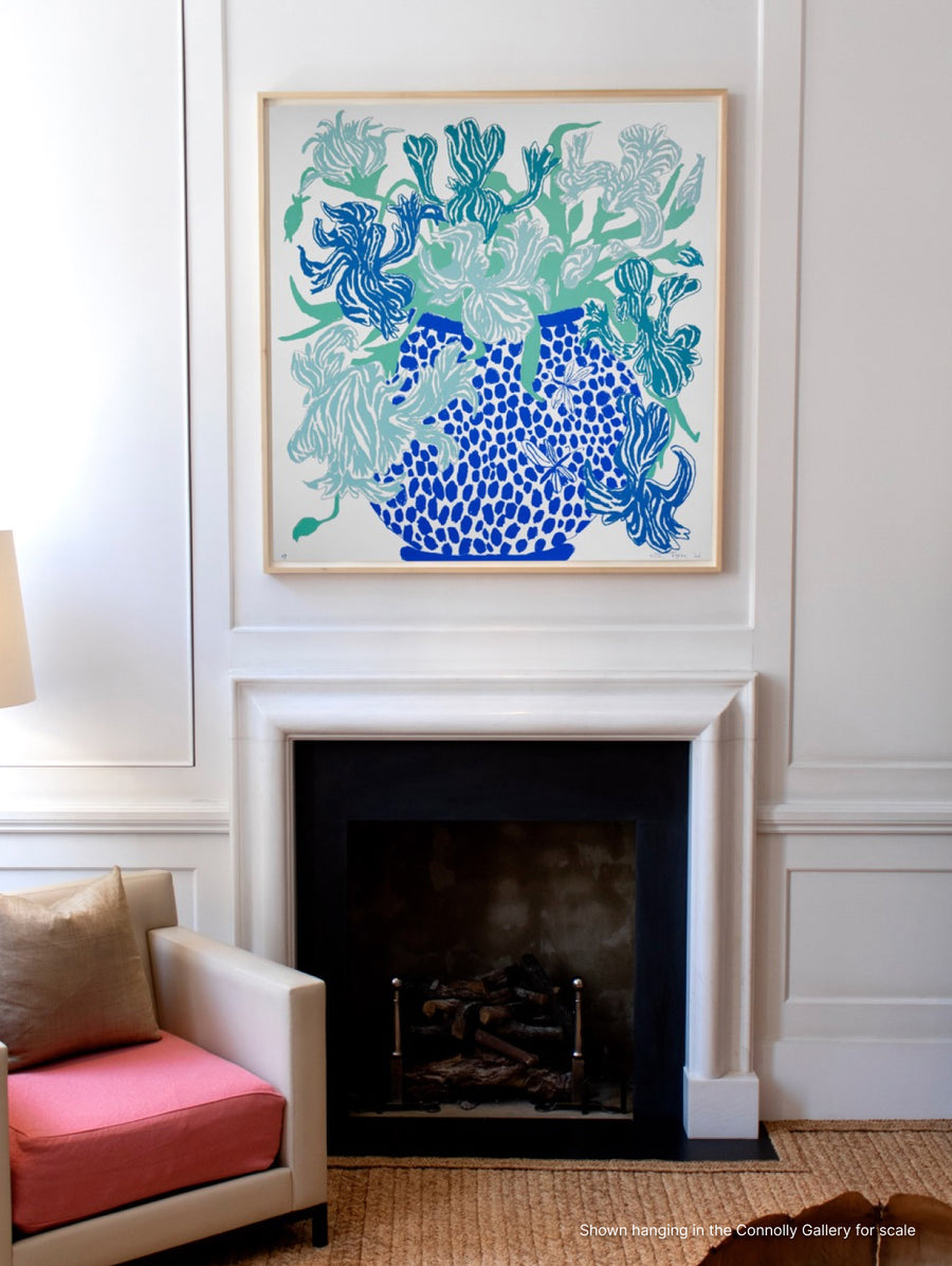
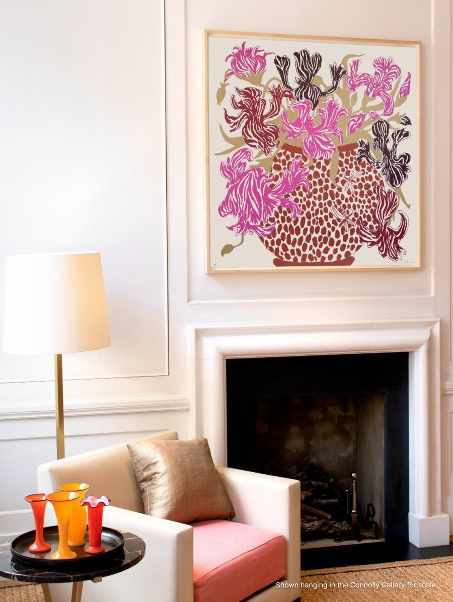
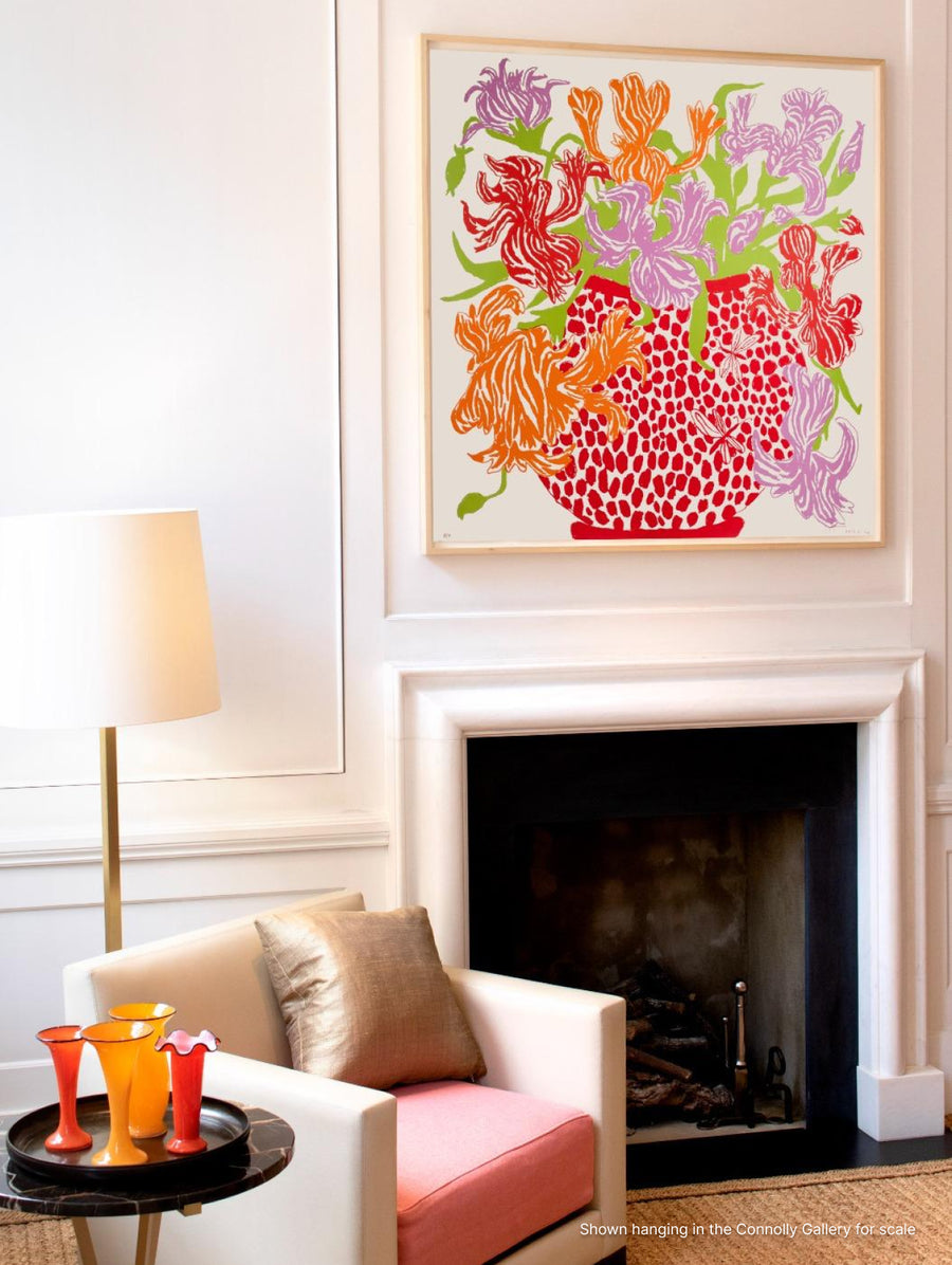
Cut Flowers: Triptych by Oisín Byrne
"These are oil based screenprints - the colours are physical pigment on the page. Each colour is hand-mixed until we reach a precise intensity: a reflective magenta, a saturated orange, a rich red oxide, a subtle gold, an ultramarine blue that is both deep and vibrant (ultramarine produces a pleasurable confusion for the eye: how can a dark colour be so bright?). Some colours are printed twice or three times on top of each other to achieve full intensity, others are given some transparency so the light of the page reflects through them. Yet others are combinations, with one colour layered on top of another. Even before the image begins, each sheet of these works is printed with a very subtle transparent off white, softening the ground. For many days at the Advanced Graphics studio we ammended colours until they hit my eye exactly as I wanted. At times this can seem, even to me, an obsessive and slightly mad task as the colour changes are so subtle. It is a testament to the process that looking back at the first colour proofs, which at the time we were delighted with, the finished pieces out-pop them considerably. I realise I have always worked best in series, and triangulating the colours of these three works in tandem challenged each to be better. The colour relationships were cycled through not only the individual works - giving each colour its own buzz or hum - but in concert - as I wanted to be able to imagine all three prints as a set, hanging in a row, buzzing off each other."
- Oisín Byrne

Brâncuși and Photography
"Brâncuși began photographing his work as early as 1900 to secure funds to cast it in bronze. He sent photographs of clay works as postcards to friends in Romania to convince them to purchase the sculptures and commission the casting. In 1970, I purchased six postcards and a handful of photographs of Brâncuși’s work in an autograph auction at Sotheby’s in London for sixty pounds. It wasn’t until the consignor contacted me shortly afterwards that I discovered that it was Brâncuși himself who had taken these photos and mailed them to Victor N. Popp, a Romanian collector and friend of the artist. Intrigued to learn more, over the next decade I met a wide array of people to whom Brâncuși had gifted photographs through the years. Publishers and composers, musicians and sculptors, girlfriends and lovers showed me photographs they had received and shared fond stories of Brâncuși: his bathtub always full of steeping photographs, making it impossible to bathe, was a recurring anecdote. John Quinn, Marcel Duchamp, Erik Satie, Florence Homolka, Mina Loy, Beatrice Wood, Nancy Cunard and Eileen Lane were among the close friends and supporters to whom the artist had gifted prints. Comparable to van Gogh’s letters and Delacroix’s journals, Brâncuși’s photographs are an index of the artist’s output and intention. Brâncuși always photographed his works in direct sunlight to accentuate the bronze’s glinting polish. But also like the painters’ words, Brâncuși’s photographs convey relationships between his works, draw out their most salient aspects and contextualise their forms within his carefully choreographed studio at the Impasse Ronsin in Paris. Brâncuși would bequeath roughly 700 negatives and just over 1600 prints to France, along with all the contents of his studio, when he died at the age of 81. Now, over 60 years later, these works continue to offer an invaluable glimpse into the way this pioneer of modernism saw his work and how it fit into the world around him. Of all his photographic oeuvre the rarest works are the flower studies. There are approximately 20 known images and no more than 3 copies of each, several are unique and there are less than 12 in private hands. He made them as gifts for his many girlfriends. Some are inscribed and others were attached to letters."
- David Grob